Sunday, August 1, 2010

More Inspiration Pages

In the few days that I've been gone, I've created 4 art journal pages. I know I've sort of been slacking on scrapbook pages, but I've decided that I'm going to focus on that this month, doing art journal pages in between. I signed up for a challenge on scrapbook.com called the Anything Goes Challenge and I hope that will encourage me to scrap more. I'm going to use my blog as a place to record the daily, weekly, and monthly challenges and that should help me blog more too! So let's get started with today's art journal pages. I'm not going to go into as much detail this time, but I'll still share pieces that I really liked about a particular page such as a color combo, a certain technique, a way I put something together, etc.

The first page is another page that has a quote on it, and, guess what, it's another TMNT quote. I know, I'm nuts, but I don't care! These are the things that inspire me, and I'm going to use them! The quote was something that Master Splinter said and it was: "Become One with the Shadows." I don't have the slightest idea why this gave me an idea for a page, but it did, and I like the finished product:


What I would like to share about this page is mostly the colors. I started out by thinking about the colors of the shadows; black, dark, dark, navy blue, etc. The yellow and white came about when I figured out that the page would be way, way, WAY too dark... I wouldn't even have been able to take a picture! And the pink letters were just because there was nothing else I had that would work! The technique that I would like to share with you about this page are the little white circles in the background. I actually started this page with a white base coat, then spread the dark blue on top. Then, using a wet baby wipe, I bunched up the bottom, plopped it down where I wanted a circle, and twisted. This was the effect it gave.
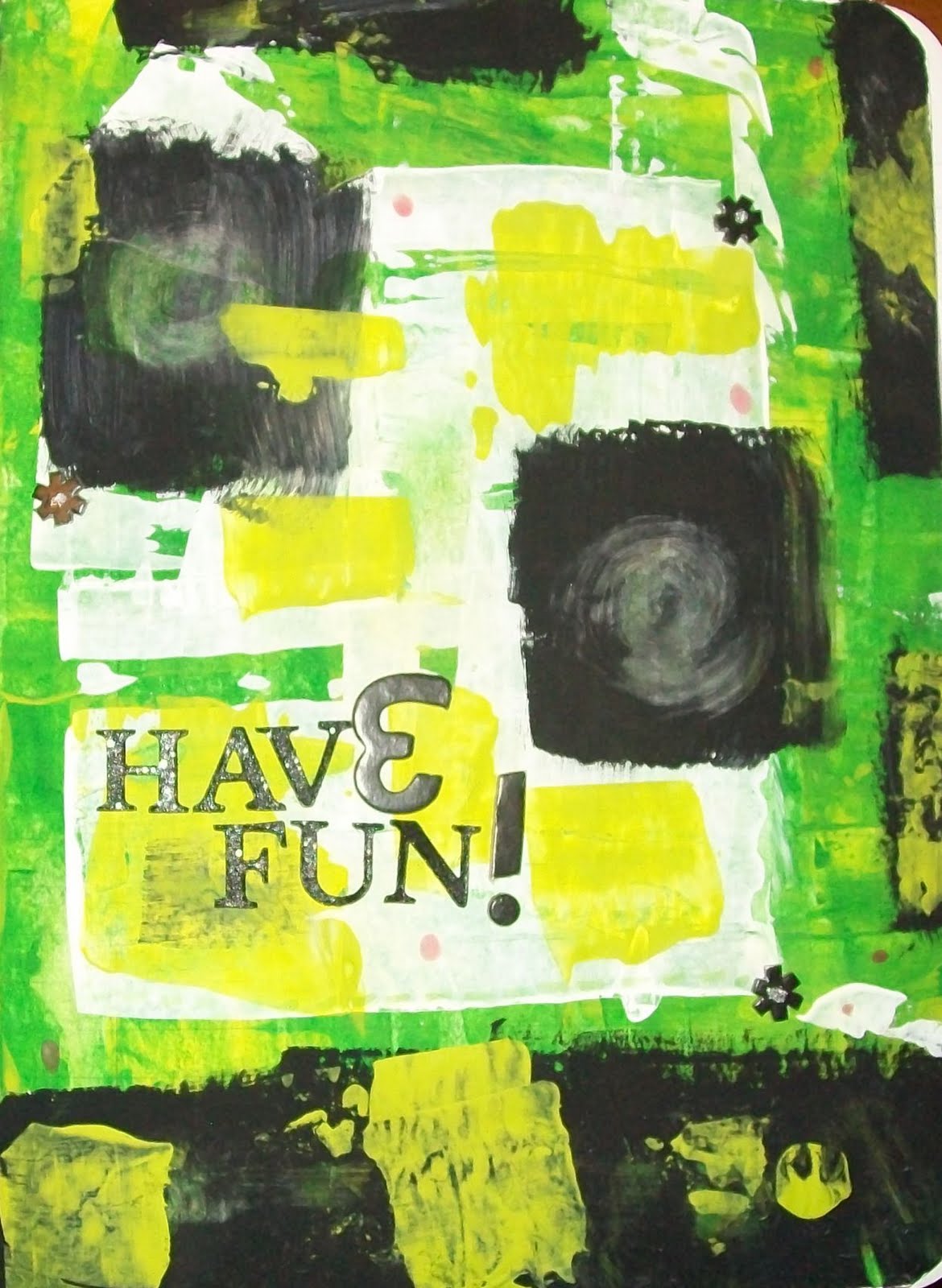


For this page I actually used the same technique as the previous one. Plopped down my baby wipe on wet paint and twisted to make little swirls. They actually remind me of comets for some reason. Might have to try a space page sometime. Hmmm. Anyways, the background was created by drizzling green, lime, and yellow paint directly onto the base sheet in my composition notebook and then scraping it around with an old gift card I just had lying around. The little 'flowers' are asterisks from a Thickers set with Stickles glitter glue in the middle and the capital "E" in 'have' is an upsidedown and flipped around '3.'


This next page is not my favorite page in the world. For real, it is one of my bottom pages. I had just received some fun goodies in the mail; Tim Holtz Distress Inks, Glimmer Mist and a bunch of stamps and some other ink pads. This was just me playing around with different techniques, trying to figure out how to make them work and finding interesting ways of using them. To start off this page, I painted the base white, then stamped an all over pattern with Pumice Stone Distress Ink. Then I Glimmer Misted the top. I layered torn and inked music sheet pieces, stamped some more images, then finished off the page with a title; the smaller letters are rubber stamps by Hero Arts and the bigger ones are unmounted acrylic stamps by Scrappy Cat.


The last page I have to share with you guys today is this one that reminds me a lot of christmas... and I know why!! The reason for this is because of the brown and the green; the colors of the christmas tree! This is a pretty simple page... lots of paint, layers, distressing, and stamping. With the darker brown circles around the stamped heart circles, that was me adhering the circles to the page with Mod Podge. I really like the way they turned out!

I definitely hope you were inspired by my pages, and hopefully I'll be back soon with some more and also some scrapbook pages!! See you soon!

~Jordan~

Wednesday, July 28, 2010

More Art Journal Pages!

I've totally been on this kick lately! I just love doing these art journal pages... they are so fun and easy to do. Very meditative as well - they make you feel GOOD! I have 2 pages out of my art journal to show you... and I did these between yesterday afternoon and this morning; it goes to show you just how quick they really are! I'm going to basically give you a step by step of each page so that you can recreate it in your own way if you so choose. The first page was just me experimenting a little bit. Here it is:


I started out thinking that this was going to be a really bold page since the colors black and red are usually very striking when put together. So those were my base colors. I painted my background black, dried it with my heat gun and then painted strokes of red over top. I thought that since my background was already dry that it would be okay, but, as it turns out, I didn't let it dry ENOUGH so the colors blended slightly in some places into a maroon like color. Since that wasn't quite the way I wanted it, I painted over top of the RED again and it become more bold it some places. I then added strokes of violet over top of the red and black. Then the page just felt really dark to me and so I decided to add lime green to the top - a lot of lime green! Since lime is my second favorite color, I think I kind of overdid it a bit, but it looks okay now. For the strips along the bottom, I used a strip of corrugated cardboard to stamp lines. The circles I stamped with a piece of corrugated cardboard cut into a circle (freehand) and the dots were put on in yellow with the handle of a paintbrush.


This next page was actually for a challenge that I started on scrapbook.com called the August Inspiration Challenge. The challenge was to watch the very first episode of TMNT (teenage mutant ninja turtles) and to make a piece of art that used something that inspired you about that episode. I chose a quote from Raphael that says "whatever they were - they're junk now!" I decide to use a gray for the background because it reminded me of metal... which is what I think of when I think of junk! Like the last page, I stroked on several different colors of paint - a lighter shade of gray and a lime green. Even then, I wasn't quite feeling it, so I added the corrugated cardboard stamp across the WHOLE page! I liked it a lot, but I still felt like it was missing something. I added the black strips along the top and bottom and a little on the sides. I then felt that I needed one more color to brighten things up, so I decided on red circles (in honor of Raphael's mask color, I used red). I actually used the bottom of my embossing powder to stamp them... I painted the bottom and stamped away! Lastly, I added the quote, highlighting the word JUNK since it was my whole inspiration for the piece. I used crayola colored pencils to write. They worked perfectly!

I hope you enjoyed looking at some more of my art journal pages, and I hope to share with you all some more scrapbook pages here really soon!

~Jordan~

Tuesday, July 27, 2010

Art Journal Start!!

I've been wanting to start an art journal for a while now... a long while! Finally the composition notebooks I was wanting to use went on sale for school and I got one... I know I'm cheap and I admit it! I painted the cover black with a strip of lime green along the binding and I glued a piece of ribbon along the transition between paint colors. Here is the first page in the book:


I REALLY like it!! I had so much fun and it was really relaxing; so easy to create. I didn't worry once about if I was going to ruin it... like I sometimes do when creating scrapbook pages. I used a bunch of layers of paint in all different colors and I stamped on it with "stamps" that I found around the house.

Thanks for looking!

Saturday, July 24, 2010

More ATCs!

I just finished up all of the ATCs that I needed to complete for the swaps I'm in now. I received my newspaper ATC from the swap I was in and I absolutely love it! I've got about 5 ATCs to share with all of you guys today. 4 of them are rubber ducky ATCs and the other one is another elephant one. Let's get started!

I guess I'll show the elephant ATC first... I really like it! It just seems that even though the small size was hard at first, I got over that really quickly. Almost every ATC I've made since I've started again I've fallen in love with!


To create this ATC, I started with a white ATC blank. I then continued on to use a brown ink pad to rub over the top, giving it a soft distressed look and feel. I selected several 1" cardstock squares in 3 neutral colors, arranging them in a grid on top of the base. I stamped an image in the lower left hand corner and added a strip of paper tape measure that I distressed. Once the elephant is on top, the ATC is complete.


Coming up with ideas for a rubber duck ATC was a lot harder than expected! When I signed up for the swap, I didn't think that it would be difficult at all to create a good looking card to swap. Boy was I wrong! I had the toughest time figuring out where the best places would be to put the ducks - goodness, even finding images of rubber ducks was hard! But I finally found enough to create all of the ATCs I needed.


As you can see, this ATC has basically the same layout as the last one. They are the same for the most part, yet so different in so many aspects. The colors are very different, as are the images. I crumpled up the background and inked the wrinkles, added a scalloped strip and white circles. I also matted the ducks in a coordinating color and put stickle dots on the circles.


I have to say, I think this might be my favorite rubber duck ATC to date! I love how his head is so much bigger than his body... It's so out of proportion, yet so cute at the same time! The supposed stitching around the edges are actually marker lines and the blue tint to the "sky" is - get this - eye shadow! I saw a package of my eye shadow in the bathroom today and thought "wow... that looks an awful lot like chalk!" Sad isn't it? It was really light, but it worked for what I was wanting.


I did this one basically the same as the previous one as well. I thought that the images themselves were just so cute, and the first ATC that I made turned out so well that I couldn't help myself from making another!

Hope you guys enjoyed looking at my work and I'll talk to you guys soon!

Thursday, July 22, 2010

Feeling Crafty

There for a while, I wasn't really feeling too crafty. I wanted to make stuff... I really did, I just was having a hard time making cards or scrapbook layouts. I made tons of ATCs and inchies, but no pages! Hopefully I'm out of that slump now! Today I made a thank you card using a few scraps of paper I had in my collection. Everything in this card was scraps. And I love it!

I did some heat embossing on the sentiment - I stamped in black ink and then embossed in clear embossing powder. I just love the effect that it gives. I inked the edges of the circle and then adhered it in the center of a circle that was already on my black pattern paper. It gives it a framed look that I love! The little strip of striped paper is actually a piece of what was leftover from my scrap of black pattern paper after covering my card. I just thought "Well, I have this scrap, I haven't used the back of this pattern yet, but I know the colors match... might as well use it!" All of this went through my mind in about a second flat. That is the way my brain works.


I also made this ATC. I've actually had it made for a while, but just haven't got around to posting it! It is the earth portion of my elements cards.


Hope you like them and have a nice day!

Monday, July 19, 2010

Inchies

So now I would like to show you guys my other inchies that I created, but didn't have time to post yesterday. There are 5 that I want to show you - some I like more than others, but experimentation is the father of invention! I'll share with you guys some of my favorite techniques and maybe some color combos.

First is this ladybug inchie. I used a plain white background, stamped with two different images in two different colors, and then added a ladybug with a pop dot. This is my first inchie that I made, and, I have to say, it was hard to make. Mostly because I couldn't figure out what in the world to put on it without making them all look the same. But I tell you the truth - they get easier! The more of these little guys you make, the more ideas you get! Here is the ladybug inchie:


This next inchie is actually the second one that I created. I was working with this butterfly stamp that I really liked, but, instead of putting it directly into the middle of the inchie, I placed it off of the edge. I then added another stamped image with a pop dot. I then added some faux stitching around the butterfly with a pen. Another tip that I have for you guys is to use a piece of scratch paper underneath your project. That way, if you are painting, stamping, etc, you have something to catch the excess. Plus, afterwards you have a decorative piece of paper that you can use to create with! Here it is.


The next one is not my favorite. At all. In fact, I kind of hate it. But I'll show you anyways. I think I would like this inchie better if the stamped image was colored in.


These last two are actually part of a series that I'm doing. A fruit series. The first one is a strawberry and it is raised up with pop dots. To get the background, I took a regular piece of cardstock, and then I took the sprinkles stamp from the nook and pantry Basic Grey collection and just randomly stamped the sprinkles over the top. I then added words from the newspaper that say one-of-a-kind flavor:


And now for the apple one. This is another masking technique that I just had to try, and since I had an apple punch that I wanted to use for the fruit series, I thought it would be perfect. Plus, since an inchie is such a small canvas, it is not very intimidating, and a PERFECT place to try out new techniques. So this time, instead of punching out shapes and using them, I punched out shapes from the sticky part of the post it note and used the negative as a mask. It worked like a charm! I then continued on to ink the edges in cranberry Ink it Up ink and then wrote out apple. Some faux stitching finished it off and gave it a homemade feel.

Sunday, July 18, 2010

New ATCs and Inchies

So recently I've been making a TON of ATCs and inchies, just because I was craving a new size. You guys have seen a couple of my ATCs, but I also made some inchies. In case some of you don't know what an inchie is, it is a small paper project, most commonly collage, that is measured at 1x1". You may think I'm crazy, but seriously, these things are quick, easy, and most of all, addicting! First off, I think I'll post my ATCs.

This ATC was originally created for the newspaper swap, but, as it turns out, I made this one a little too late to enter it, so I'll just post it on my Flickr as available. Here it is:


Next up, we've got some ATCs that I made for an elephant swap. The first one I'm going to show you is collaged. It has a cardstock base that was crumpled up into a ball, flattened out and smoothed, and then this process was repeated 2 or 3 more times. Then the creases were inked by rubbing an ink pad flat over the top of the ATC. I also inked several other portions of the ATC. The epoxy sticker is from ColorBok and I bought a pack of 12 at Target for a dollar. The stamped word is by Scrappy Cat and it is the Playful Classic. The edges were distressed by painting around the edges with tempera paint.


The next elephant ATC was drawn. On occasion I like to experiment with drawing and shading with Primsacolor pencils. Prismacolor pencils have a softer lead than regular colored pencils, which gives them an effect that might not otherwise be possible.


The last of the ATCs are for a swap I'm doing that is based around the 4 elements. The 3 that I'm about to show you are very simple, yet they still turned out really nice looking. The 4th, which is Earth, is not going to be the same. I'm actually going to draw that one as well. So for the 3 other elements, I simply printed out an image as big as an ATC to use for a background, then adhered it to a piece of cardstock to make it sturdier. Then I used the Playful Classic acrylic stamps again to spell out the correct word. I then cut them out, rounded the corners, and inked the edges. Perfect! First is the fire one. I have to say that I think I like this one the best. I used Ink it Up ink in the color Terra Cotta. Very pretty.


Next up we have the water ATC. I have to say that I REALLY like the image in the background. I just think that it's really cool. Again I used Ink it Up ink, but this time I used Indigo as my color:


Last of all the ATCs is the Wind ATC. I really like the image in the background of this ATC as well. The element is actually air, but since a tornado is just moving air, I decided to use a tornado as my image, and wind as the caption. I think it turned out pretty good!


Okay, that was all of the ATCs, so now onto the inchies we go! I'm only going to show you 2 ATCs today, and the rest tomorrow. The first inchie I'd like to show you is an inchie that I created earlier today. I stamped the background using the stem portion of flowers and it reminded me of bamboo! Well anyhow, I added the stamped image of a star, and then stamped cherish along the bottom edge:


And the last project that I'm going to show you today is my favorite inchie of all: one that I call entertainment. I punched out a bunch of flowers from the sticky part of a post it note and then stuck them onto my base. I then painted over it with lime green paint, added buttons and a piece cut from a newspaper. Complete!


Hope I inspired you and hope to see you next time! Bye!